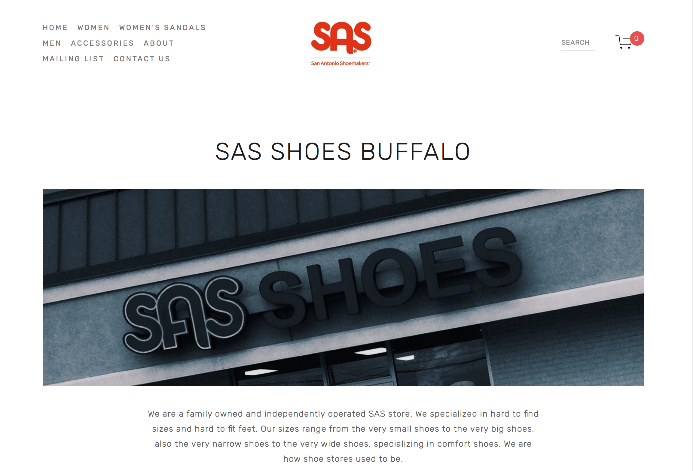
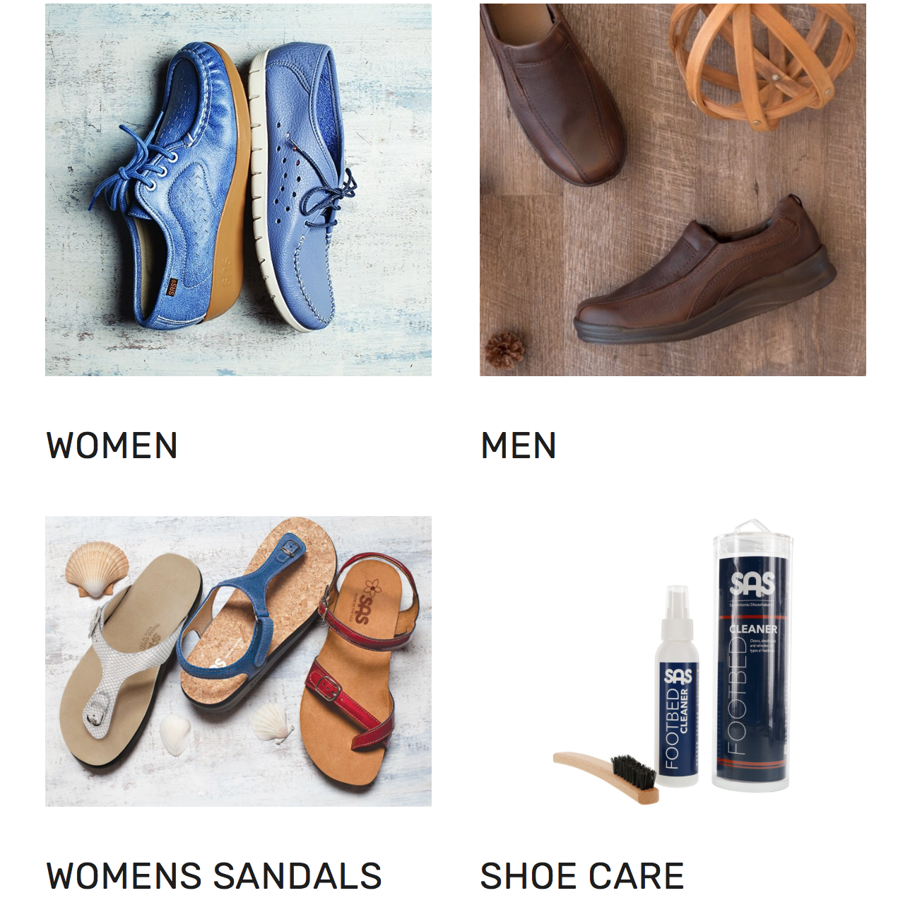
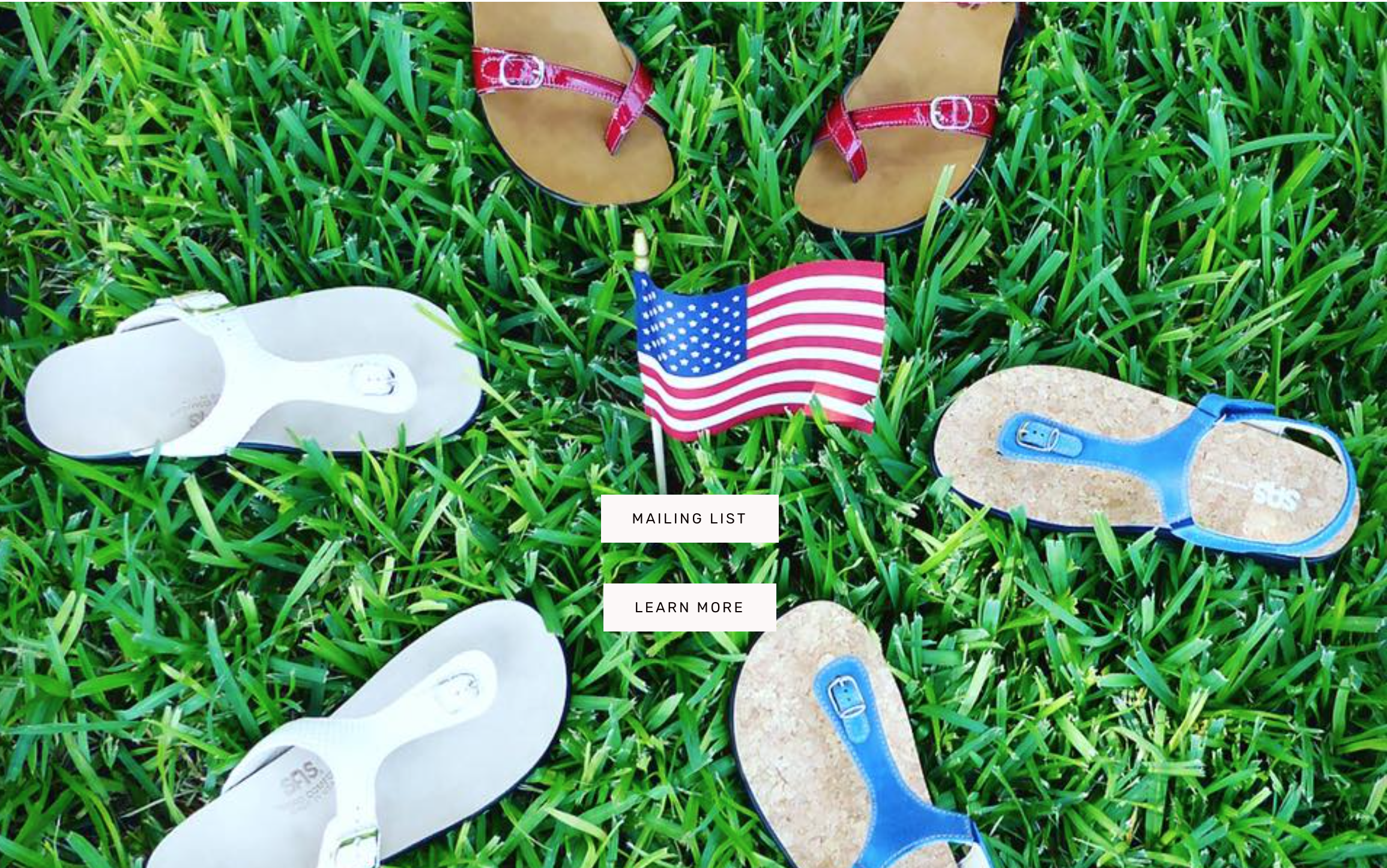
Last month I started working on the redesign of www.sasshoesbuffalo.com. This is the first major Commerce site I worked on thru Squarespace, and my 4th site creation. SAS Shoes is a comfort shoe company for men and women, plus it is AMERICAN-MADE!!
What Did I Learn From this Site Design?
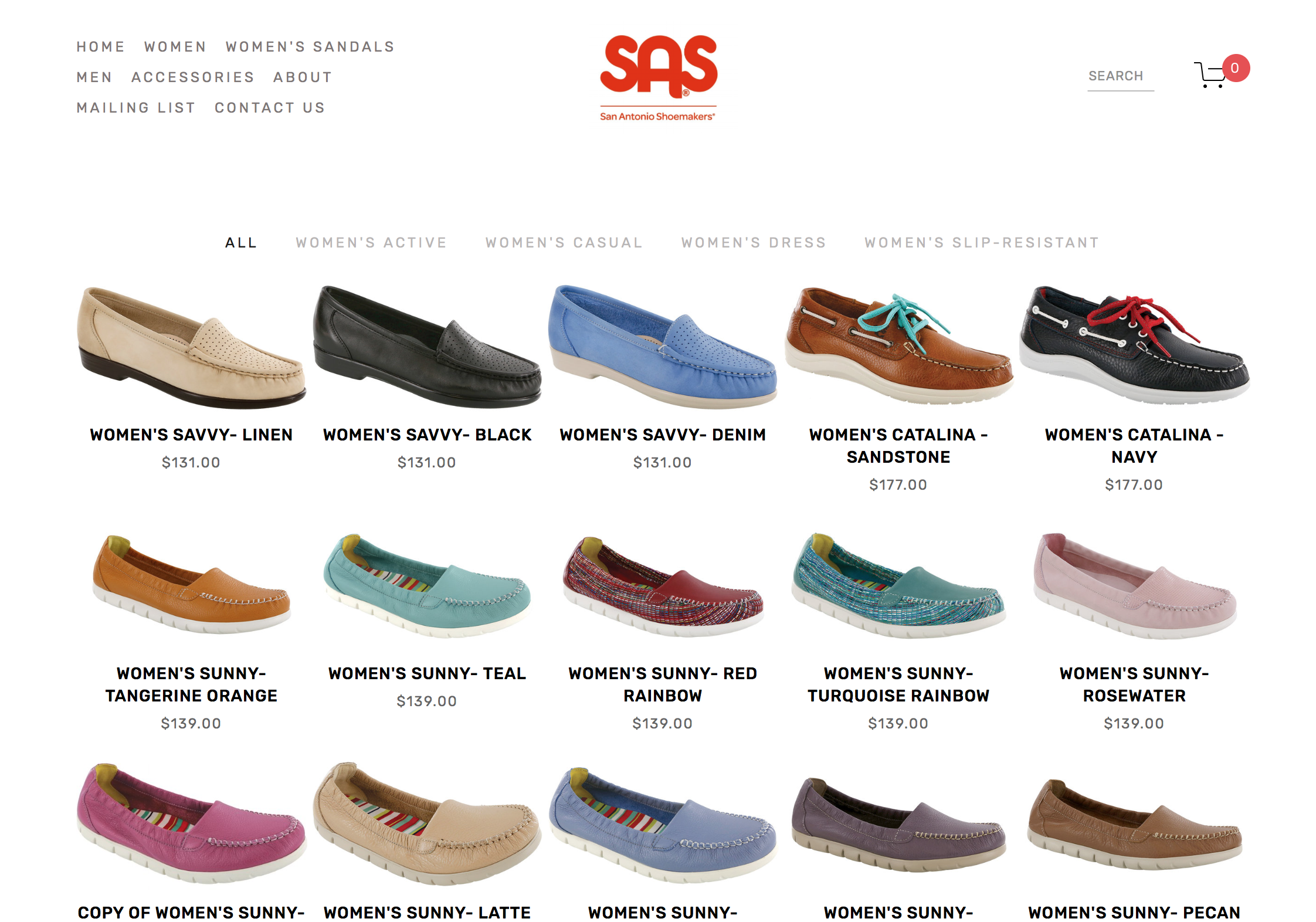
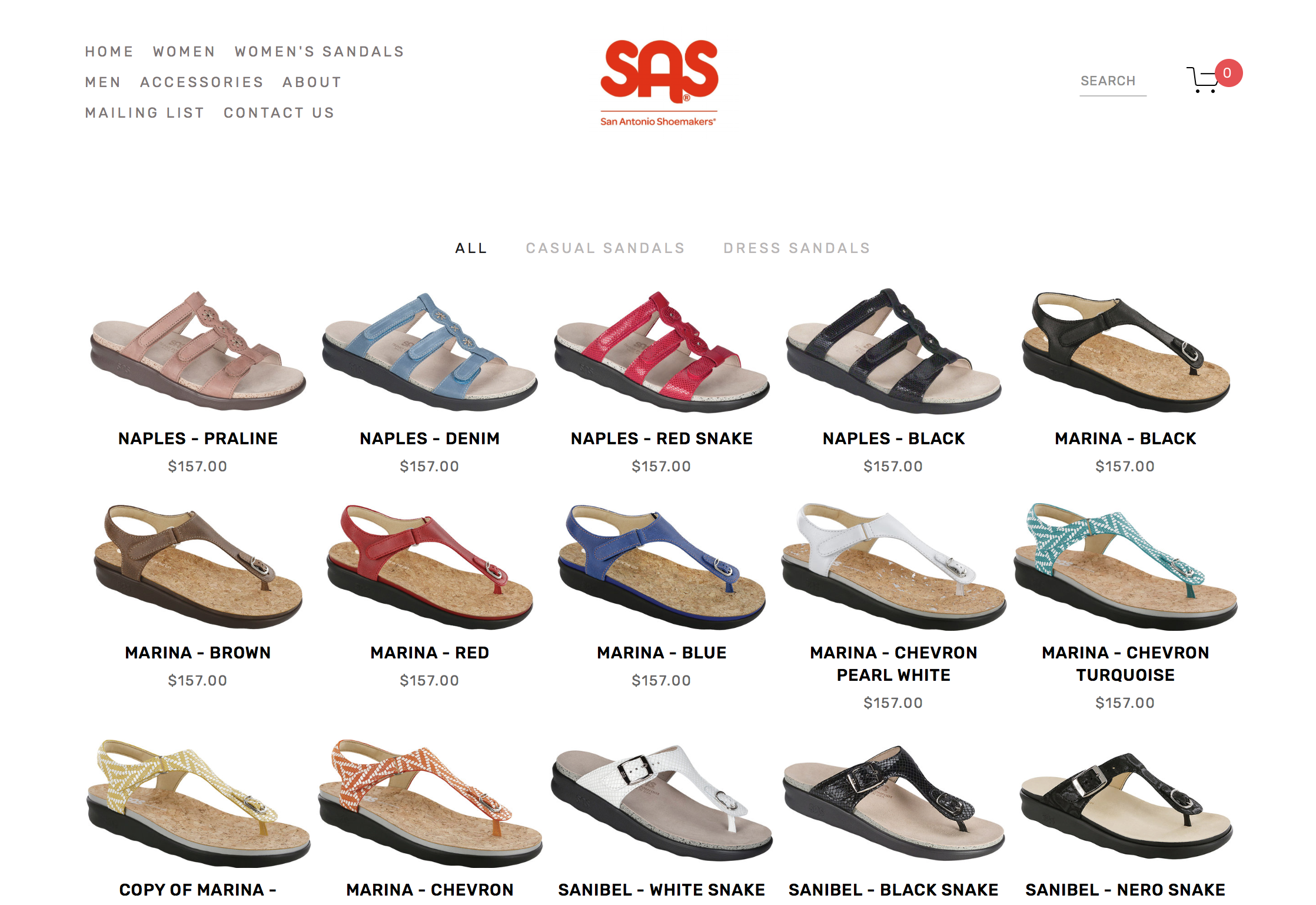
1. Patience for Product Listings. This took way more time than I envisioned it taking at the beginning. First, I didn't think I would have to create a separate listing for every shoe model and color. Plus, the numerous sizes/width combos available is a really long list! Squarespace has limits, so it wouldn't allow 1 listing for all the shoes because that is more variants than the code can handle. SAS is full of options. Some shoes have almost 100 variants available! They offer Slim, Narrow, Medium, Wide, Double Wide, and even Triple Wide in some models. Each shoe/color had to be a separate product listing. I cross-referenced with the corporate site to make sure I had the right sizing offerings. I started off creating a shop folder, with subcategories for Casual Shoes, Sandals, Dress, Active. In the end, the client need to have all the shoes together really needed to be met. For example, I merged Casual, Dress, Active, Slip-Resistant so that one can shop all of Women's shoes together, or click on those categories to filter the shoes. Since there are so many sandals, they are separate, with their own subcategories. Squarespace limits the number of products per shop page as well, so that is also a good reason for Sandals to be separate. I am really glad I did create it first with all the different shop pages, because it is easier when creating the listings to have them grouped that way. I made sure I used tags and category tagging so that when I merged, the shoes that are labeled "Active" all populate when the viewer clicks on "Active" to see those shoes. Time is spent uploading images to the listing, adding listing copy, and creating the price, size and width variants.
2. Thumbnail Images can be your nemesis. Shoes images were shot on different angles or the image was too wide for the thumbnail frame, so I had to do quite a bit of troubleshooting (thank you patient Squarespace helpers) and Photoshop work to change the canvas and image size so that the image would fit in the thumbnail view. Luckily not every shoe had to be fixed, but there the majority did. This really was the frustrating part, because after spending so much time creating all these listings, the last thing I wanted was to have to go into Photoshop and change all the thumbnail images one by one to create more white space so that they didn't auto crop. Plus, it took a bit of time and the whole shoe needed to be seen in the thumbnail view in order for the online shop to get approved. Once this back and forth of fidgeting with the canvas/image size, reloading the site view, I got the images to view properly. It took a bit of maneuvering to get the right width and height to fit the frame. Delight is a wedge, so that had to have even more white space, in order to fit as well.
3. I learned a lot about SAS Shoes. If you are on your feet all day or have problem feet, you need to go try on a pair of SAS Shoes. Your feet are worth it! Go visit my brother's store in Williamsville, NY or shop online! He and his knowledgeable staff can help you out. Now that I am well-versed commerce site design, if you are looking to create one for your business, check out SAS Shoes Buffalo, and contact me so we can set it up!

