Giphy Designs
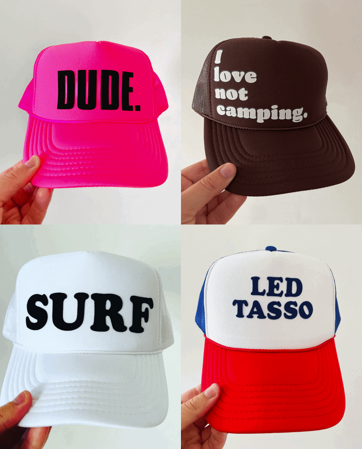
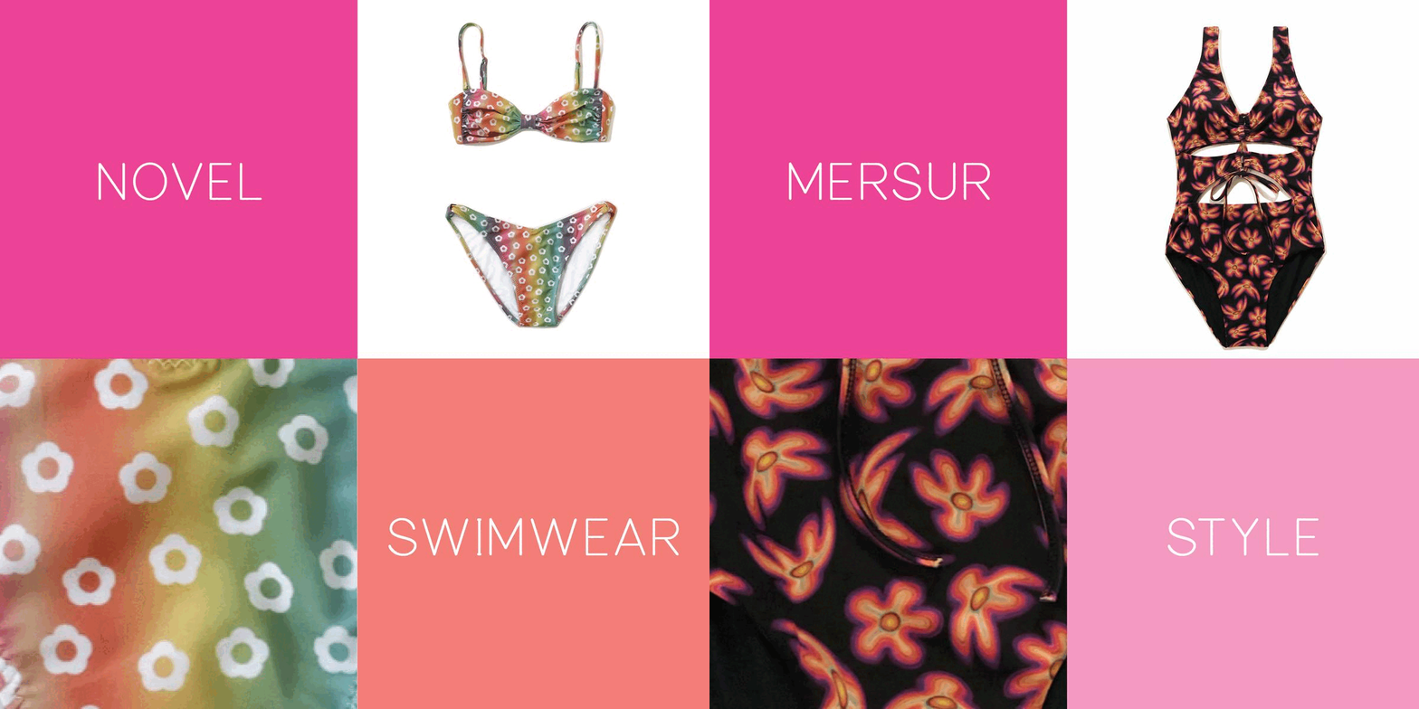
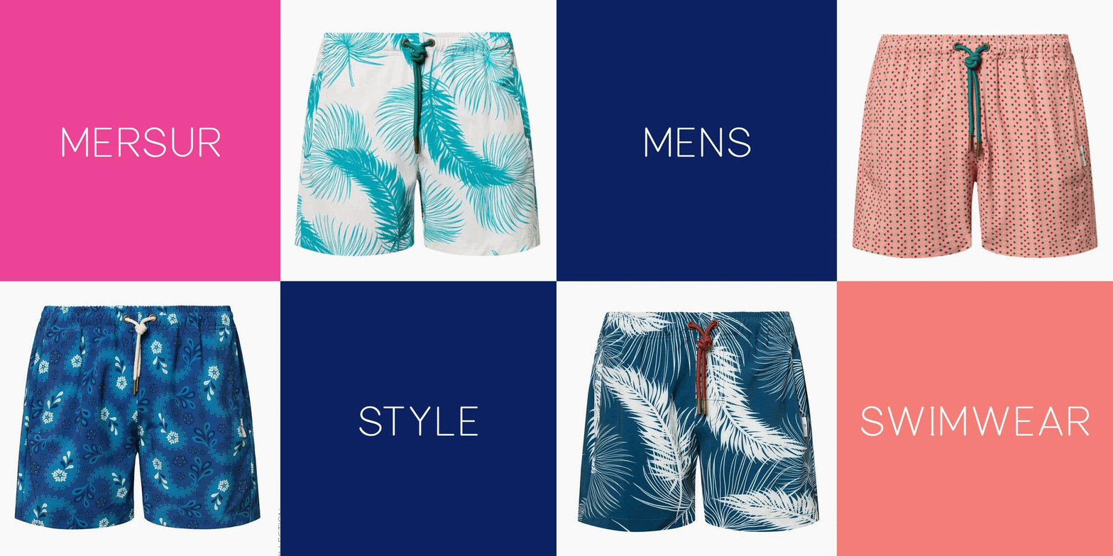
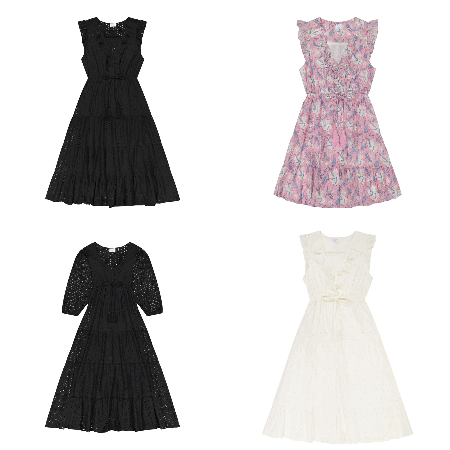
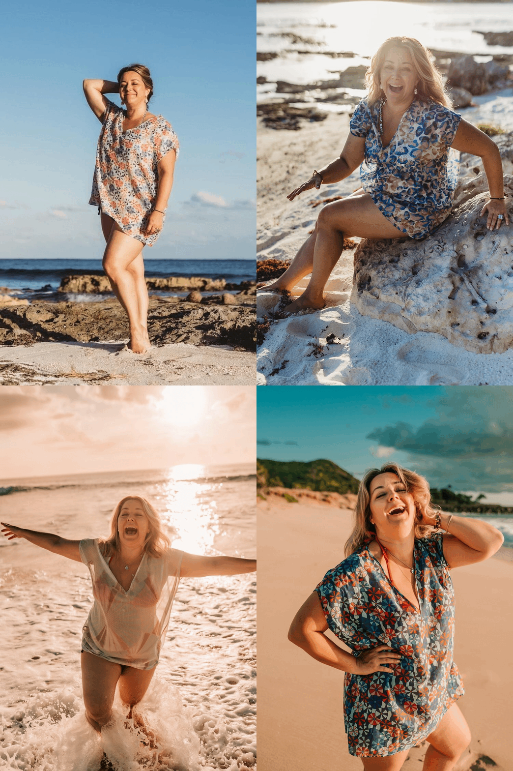
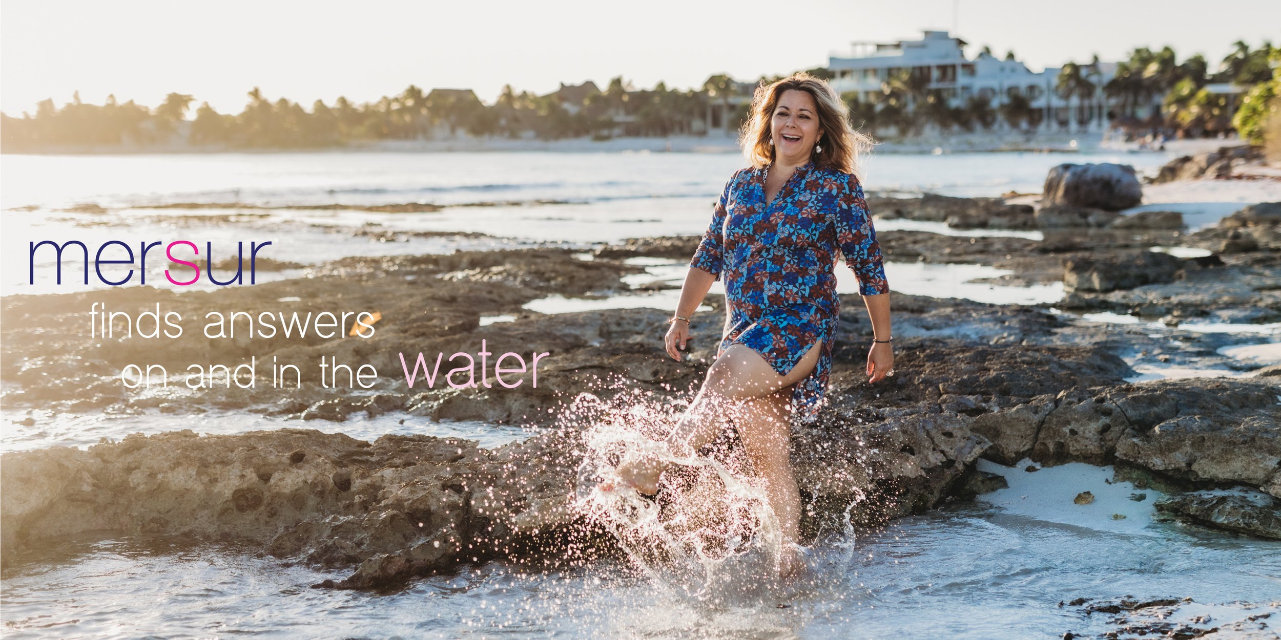
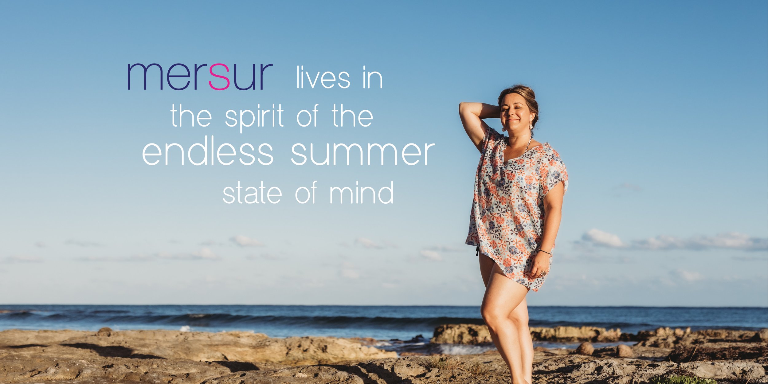
Squarespace Web redesign | New Banner Images
Brand Identity


I love helping business owners transform their brand with a new logo. A recent brand I created and is still a bit of a work in progress is for Fame Hair by Livia. I gave the owner a bunch of options and now I am refining her final selection.
Below is a sample of her first round of logo designs:
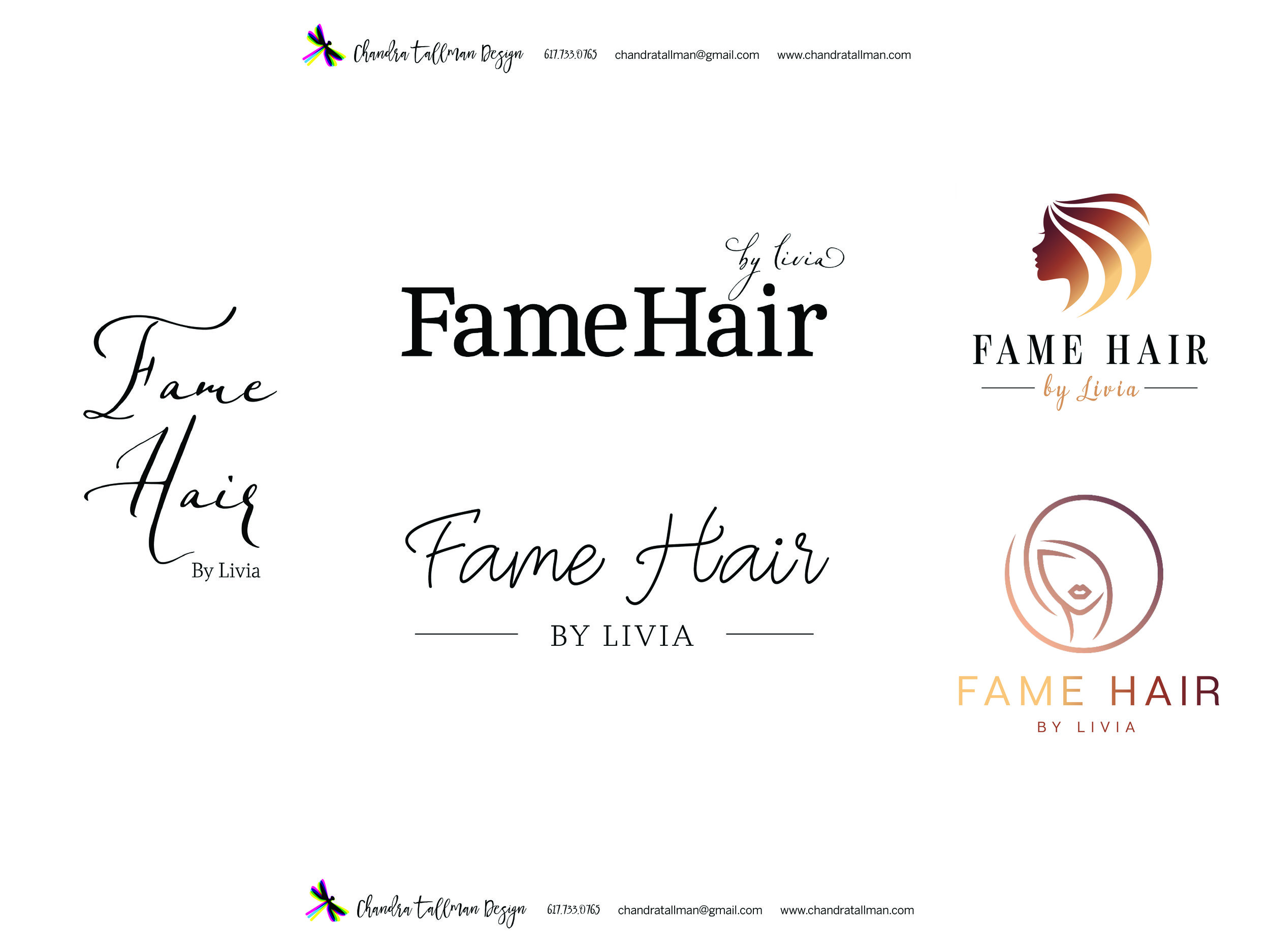
This round was a mesh between the Round 1 far right design options.
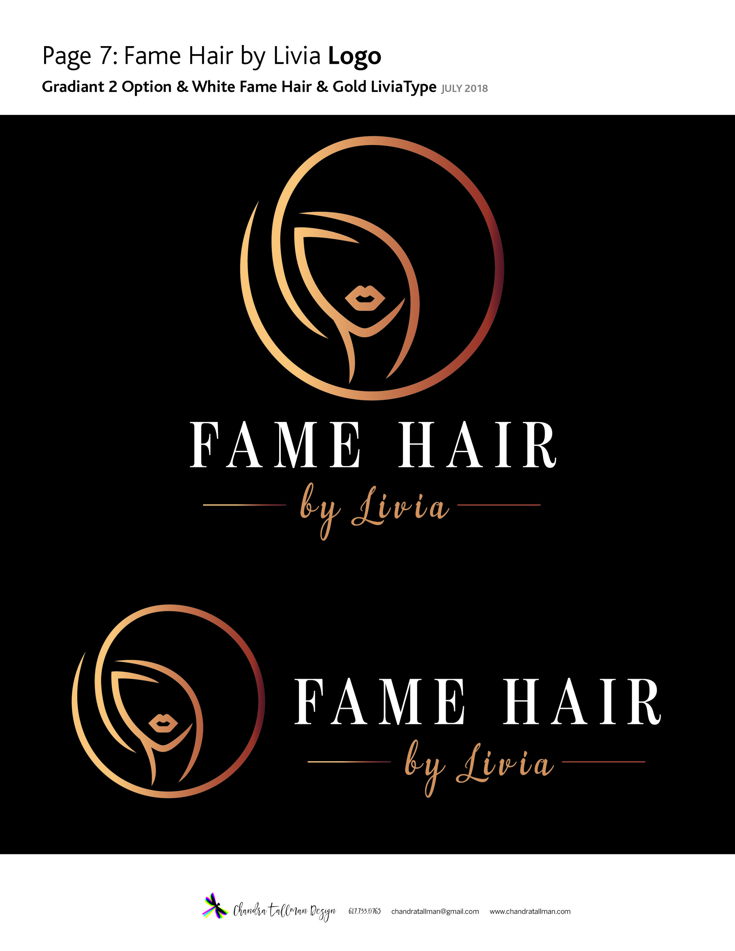
In the process of refining the logo design tonight, the typography had to be tightened up a bit on the "by Livia" portion...way too loose.
Here are my two ideas for business cards to be printed on rounded on edges.

Which business card front side do you like? The design on the left or right? Below is the tightened logo design. This is still a work in progress. I like the business card on the right using a rule above and below Fame Hair. So it looks like I will be doing some more tweaking to this logo before sending it off.

Below is a refined logo that feels like the one to me. I love the vertical lockup but this could easily be horizontal if needed. Also below is a business card that highlights the logo mark.


Elite focuses on custom masonry in the greater Boston area creating patios, walkways, and outdoor living spaces. The owner of Elite came to me with a few design requests for his business.
1. Business Cards
2. Website Creation
3. T-shirt Design.
Brand Identity: Some companies have a logo they like and want to keep. Elite had a logo, but I recreated a new logo to be used on all of their branding. With Elite I created the logo and different type choices for the name of the company. I gave the owner several options to choose from. From there I created business card options with double sided printing and images showcasing examples of their work.
Website: This business did not have a website, but it does have a Facebook business page and Home Advisor Listing. So I created a site from scratch. The purpose of the site is to showcase the beautiful masonry work and give customers a spot to request a quote. The work makes this site come alive. I compiled all the information and photos, wrote the copy and created his website. This site came together quickly due to quick turnaround of asset delivery and decision making from the owner.
I have also assisted with creation of advertisements for Elite Stoneworks as well.
Contact Andre for your next outdoor hardscape design, you will be amazed at their beautiful craftmanship!
Fall means back to school, new clothes and for me an updated website with recent work. I'm working on branding myself and increasing more traffic to my site and building my business clientele. Please let me know what you think of the way my website looks. I am using logos for each of my portfolio sections to be the slideshow when viewers land on my site, instead of the first sample of work being cropped/chopped off in the previous view.

Case Study: Period Partners - Together for Menstrual Health
Client: Period Partners is a non-profit that is giving menstrual products to those in need on the North Shore area outside of Boston.
Step 1
To kick off this logo project, I sent the client a list of questions to answer and send back before we had a phone consultation. These questions range from company-related to project related questions. This information is essential in the process of design.
Step 2 Phone Consultation
In this particular conversation, the client didn't want the logo to be too feminine. They wanted to show working together/partnership, accessibility, an engaging look, and inclusivity to all who menstruate. They wanted a logo that was "fresh, dynamic."
Step 3 Ideas & Round 1 to Client
After we have the phone consultation, I send over an estimate and contract for the project. I like to draw, so I usually do several ideas with pen and paper before I sit down and start working on the computer. For the first round of ideas, I send options of wordmarks and logo designs in black. A logo needs to work black before you can even think about color options. What is a wordmark you ask? A wordmark or logotype is when only the letters of the name make up the logo. Round One also had different options on the typography used. At the bottom of this blog, you can see some options that were included in Round 1.
Step 4 Round 2 and 3
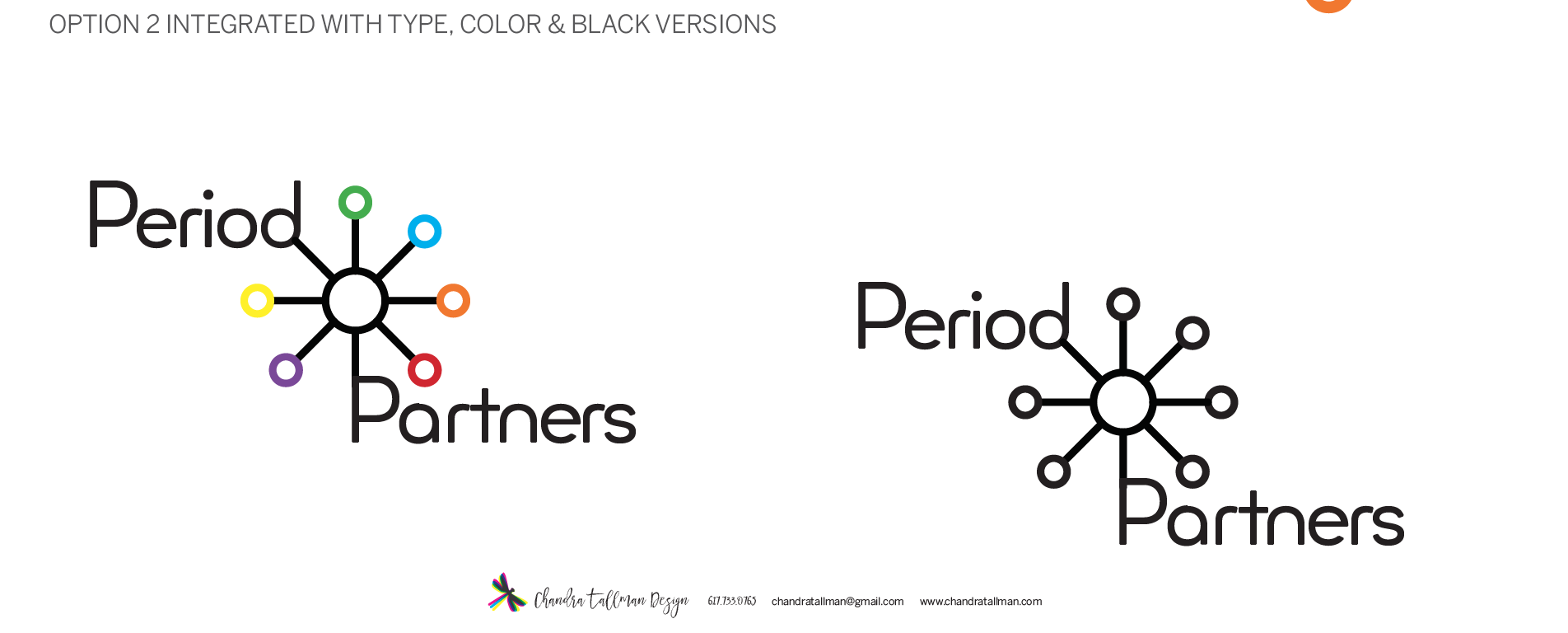
In Round Two, the ideas were refined into translated 2 options and showing color variations, how the logo would work on their stickers, and a business card. In Round Three, the client asked to see some more variations and refinement of the color option. This led to me showing some more variations on position of typography and the graphic symbol. After this version, the client made a decision. The final logo uses a geometric dot pattern and the typeface Minimo. This typeface had a modern feel and I loved the rounded shapes of the letterforms, also playing off the roundness of circles/the period. In the earlier rounds, the word Partners was set in cap P and lowercase for the rest of the name. The lowercase letter "t" in this particular font was one of the factors in choosing this typeface.
Final Delivery
For the final delivery stage, I put together color versions of the logo and a branding guide. The branding guide shows the usage rules of the logo, with and without the tagline, size do's and don'ts, and the color breakdown (CMYK, Pantone Colors). This guide is another essential component of logo design. For this project, I purchased the font Minimo, through Creative Market, a great resource. So I will be passing the baton over to the client now, to be in charge of keeping this logo in check.
If you would like a Brand Identity or logo designed and work with me, please contact me at chandratallman@gmail.com or call me at 617.733.0765. I'd love to work with you!



Sticker Design in use!

I love working on Brand Identity Projects. Sketching out ideas by hand, then going to work digitally to create the next step on my computer is fun work for me. Plus, helping people make their business look pulled together with new brand identity is a game changer for the client! I enjoy making their logo dreams come true. It can also be thought of as problem solving. Problem: Logo/Identity Design. Solution: Research + Consultation +Sketching leads you to the process of creating the new brand.
Case Study: Brand Identity and Web Design Project for Red River Child Care Food Program out of Texas.
Client Background
Red River assists child care centers and home day care centers with putting nutritious foods on the plates of the children. They also help with many other important aspects like meal planning, center topics of concern, and training too.
Design Thinking So thinking on the lines of nutritious food and love because we want our kids to be well fed and loved when they are cared for away from home, led me to this creation. Those ideas together generated a heart with the leaves sprouting out of it. I wanted this to be happy and fun, and chose bright colors for the brand palette.
Step 1
I put together a mood board of photos and illustrations as part of my research for Red River's new identity. Next, I sketched logo ideas on paper before I sat down to work digitally. I put together some options and when I showed the client, the heart and leaves was immediately chosen. "Stop, that's it!" the client said.
Step 2 Refinement & Design Pieces
I swapped some typeface choices and we were there pretty quickly with this final logo design you see above. From there, I designed a business card and a magnet for the client. We are also planing on producing a trade show banner in the next month.
Step 3 www.redriverccfp.org
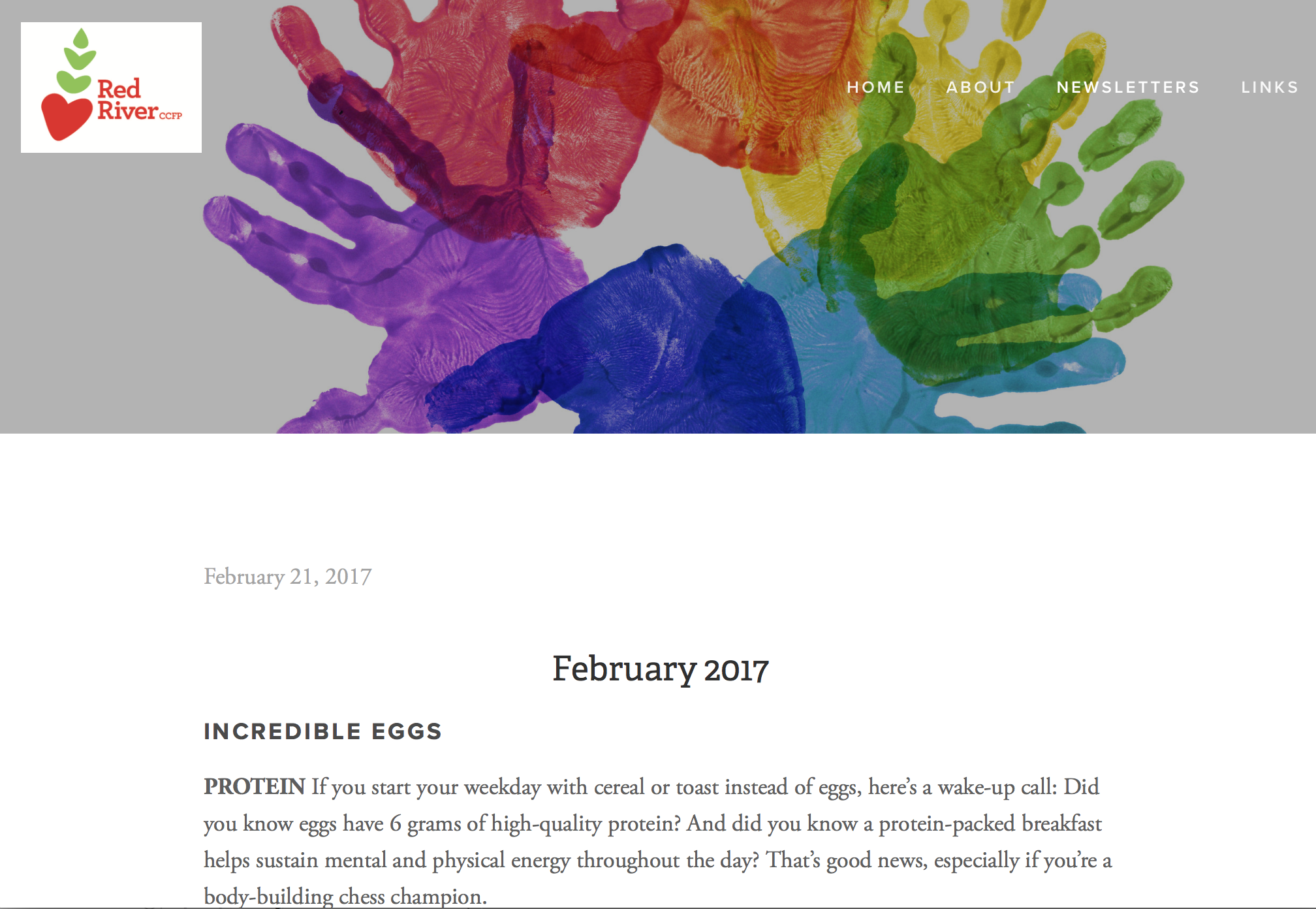
I created the website for Red River after discussing with the client their needs and preferences. They gave me an outline of the types of pages they wanted, its content, and links to competitors for comparison. I chose all the imagery, and wanted to use bold photography to set Red River apart from it's competitors. The majority of the images choices I made for the website came from the mood board I created when I first started the project (back in Step 1). I provided custom design work for the rate sheet, another way to keep the brand together, instead of using plain list of text. In addition, I am also maintaining the site, uploading newsletters each month, plus designing some marketing materials for events. Please check out www.redriverccfp.org and all that it has to offer!
DO YOU NEED A NEW BRAND IDENTITY?
If you would like to have your brand identity updated, this is a list of what to expect in the process (web design, monthly web maintenance, and other marketing materials is an extra fee):
THIS PACKAGE INCLUDES
Ready to take your business to the next level? Contact me at chandratallman@gmail.com to set up a half hour information call. I’ll get to know all about your business and you’ll get to know about my process! We can discuss pricing, and I will send you a job estimate with a timeline of milestones. Reserve your spot in my design schedule with a 50% deposit and signed contract.
If you would like a Brand Identity or logo designed and work with me on other types of design, please contact me at chandratallman@gmail.com or call me at 617.733.0765. I'd love to work with you!
