Latest Annual Report Design is DONE! Click on link to view the 36 page report digitally!
https://impactclimate.mit.edu/.../mcsc-annual-report-2022/
Fan Diagram by Chandra Tallman Design
Chandra Tallman Design Blog
Latest Annual Report Design is DONE! Click on link to view the 36 page report digitally!
https://impactclimate.mit.edu/.../mcsc-annual-report-2022/

Fan Diagram by Chandra Tallman Design

Now booking for 2021 Design Projects

I grew up in retail, starting making bows and wrapping presents at Christmastime at Tallman’s Dept. Store. I learned from my dad, grandfather, mother, grandmother, aunt that worked at the store. I also learned from all the other employees, plus high school & college aged kids that passed thru over the years. Officially put on the payroll at age 15. My parents sell women’s, men’s, and big & tall clothing, accessories, and even send out UPS packages out back. They have a little of everything and at one time, my dad’s Petroliana collection was on display. He downsized that last summer and in another post, I’ll have to show the book I designed of the photoshoot I arranged to showcase that collection.
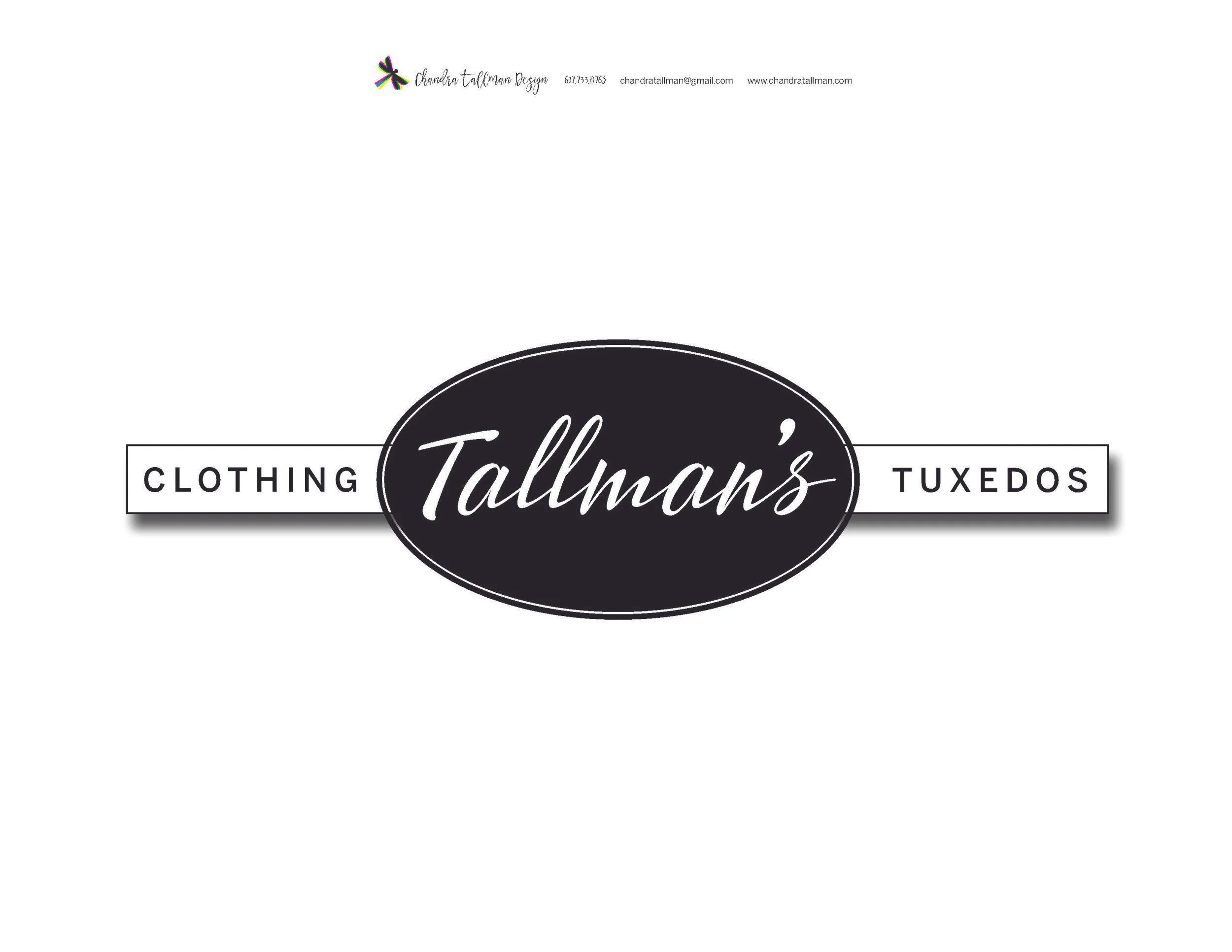
I’m proud to have created a new sign for the building of my parent’s business. It used to have a clothing hanger in a box, a symbol in a box. Mom said it was well overdue for a refresh. And, if you know my mom, you know that needs to get done.
So many months ago, we discussed what they were looking for, what they liked. I did my own research to see what we could do that would be a mesh of ideas and my own. I created several options for them to choose from to showcase the clothing and tuxedos. We wanted it to be classy, loved the look of black and white, have a touch of handwritten font, and be able to stand out on the light tan building.
And today the sign is on the building!! I will try to get some more photos next time I’m in town.

Hello! One of my latest logos designs was for Pristine Cleaning of Southborough, MA. They specialize in non-toxic cleaning practices for your home or business, so we wanted to deliver this message visually with their logo.
I helped PC create a new identity, business cards, Payment/Survey Envelope, T-shirt Designs, plus Facebook Business Page/Social Media Posts. It is really rewarding tocreate designs and make a difference in a business.
Strong Brand Identity = Brand Impact in the Marketplace
Here are the working designs for the logo design. I tried some options with lavender, and also a bucket with the leaves, using green/nature and blue/water.


Chosen Logo Design. The bucket with the leaves was the winner. The logo needs to have a few different versions:horizontal, vertical, black and white, color. Some translate well on no background, and others need to knock out so they stand out on a background.
Payment/Survey Envelope. My client had the idea to have a survey envelope, to produce and their clients could also add their payment. This is a great touch to leave, and another signature piece for your brand.

Facebook. I created the Facebook Business Page for the client and all Post Imagery check it out, click here.
@pristinecleaningma
This is a great infographic by Creato that displays the five types of logo design. Most clients I work with want a combination of a wordmark and graphic, ex. Red River CCFP, Ciao Bella Fitness, Period Partners. One of my favorite wordmark logos is the FedEx logo by Paul Rand. I love the use of negative space that creates the arrow in between the E and x. When I am working on a logo project, I approach my list of to-dos attempting to create examples of the brand in these types of logos during the design thinking process. Then I narrow down the ideas and present the strongest ones to the client.
What type of logo do you currently have? Is it working for you? Contact me for a custom logo design for your brand!

Fall means back to school, new clothes and for me an updated website with recent work. I'm working on branding myself and increasing more traffic to my site and building my business clientele. Please let me know what you think of the way my website looks. I am using logos for each of my portfolio sections to be the slideshow when viewers land on my site, instead of the first sample of work being cropped/chopped off in the previous view.
Five Reasons I'm better than Fiverr or other sites like that.
Keeping this short and sweet
1. I create custom designs for you. I'm not cookie cutter. Check out the examples of my work here.
2. I have two decades of experience in the branding, magazine/editorial world, and training in Graphic Design from Simmons College. I love pouring over Brand Style Guides and being the "Logo Police" on a brand.
3. I'm passionate about what I do, and give 110% to do the best design job for you. I am a sucker for great typography, super neat details on styling, and I'm not a fan of colons. There are type styles to avoid colons.
4. I'm a multi-tasker... a mom... I can juggle a lot and don't like to waste MY TIME or YOURS.
5. Service with a Smile. I won't stop coming up with ideas, until you are satisfied! Read some of my testimonials. Life is too short to not smile, people!!

Chandra Tallman Design Facebook Post

Case Study: Period Partners - Together for Menstrual Health
Client: Period Partners is a non-profit that is giving menstrual products to those in need on the North Shore area outside of Boston.
Step 1
To kick off this logo project, I sent the client a list of questions to answer and send back before we had a phone consultation. These questions range from company-related to project related questions. This information is essential in the process of design.
Step 2 Phone Consultation
In this particular conversation, the client didn't want the logo to be too feminine. They wanted to show working together/partnership, accessibility, an engaging look, and inclusivity to all who menstruate. They wanted a logo that was "fresh, dynamic."
Step 3 Ideas & Round 1 to Client
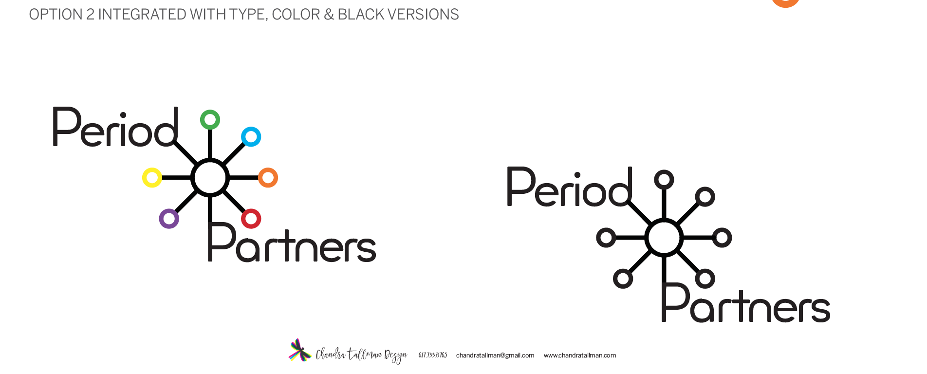
After we have the phone consultation, I send over an estimate and contract for the project. I like to draw, so I usually do several ideas with pen and paper before I sit down and start working on the computer. For the first round of ideas, I send options of wordmarks and logo designs in black. A logo needs to work black before you can even think about color options. What is a wordmark you ask? A wordmark or logotype is when only the letters of the name make up the logo. Round One also had different options on the typography used. At the bottom of this blog, you can see some options that were included in Round 1.
Step 4 Round 2 and 3
In Round Two, the ideas were refined into translated 2 options and showing color variations, how the logo would work on their stickers, and a business card. In Round Three, the client asked to see some more variations and refinement of the color option. This led to me showing some more variations on position of typography and the graphic symbol. After this version, the client made a decision. The final logo uses a geometric dot pattern and the typeface Minimo. This typeface had a modern feel and I loved the rounded shapes of the letterforms, also playing off the roundness of circles/the period. In the earlier rounds, the word Partners was set in cap P and lowercase for the rest of the name. The lowercase letter "t" in this particular font was one of the factors in choosing this typeface.
Final Delivery
For the final delivery stage, I put together color versions of the logo and a branding guide. The branding guide shows the usage rules of the logo, with and without the tagline, size do's and don'ts, and the color breakdown (CMYK, Pantone Colors). This guide is another essential component of logo design. For this project, I purchased the font Minimo, through Creative Market, a great resource. So I will be passing the baton over to the client now, to be in charge of keeping this logo in check.
If you would like a Brand Identity or logo designed and work with me, please contact me at chandratallman@gmail.com or call me at 617.733.0765. I'd love to work with you!


Sticker Design in use!